Tips & Insights provides advice on and examples of technology used to simplify and streamline IR activities, as well as real world examples of visual displays of data (e.g., charts, graphs, maps, tables, pictures). These eAIR features are developed by members.
-
Course Enrollment Trends Dashboard
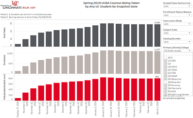
University of Cincinnati students often take classes offered at other UC campuses and vice versa. UC Blue Ash regional campus administrators and academic chairs wanted to better understand how many UCBA students we...Read Moreabout: Course Enrollment Trends Dashboard -
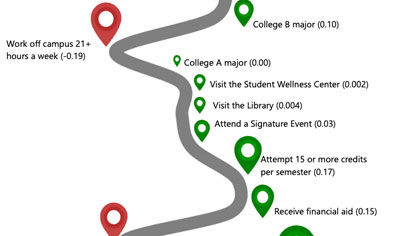
Visualizing Regression Results for Non-Statistics Audiences
The Office of Assessment at the University of North Florida (UNF) uses infographics to succinctly visualize student engagement and success data. We’ve found them to be a useful platform to share focused messages wi...Read Moreabout: Visualizing Regression Results for Non-Statistics Audiences -
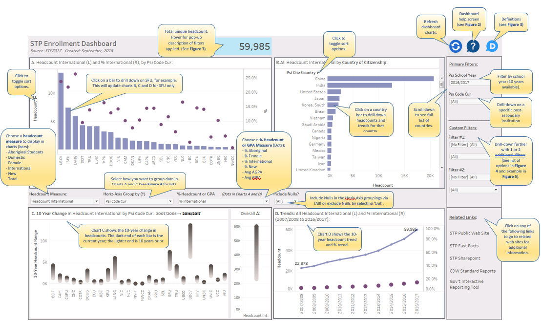
Visual Guide to STP Enrollment Dashboard in Tableau
Figure 1: STP Enrollment Dashboard Introduction Tim Miller, a blogger for DataViz at Data Science Central, recently offered suggestions for Creating a Great Information Dashboard. He nicely summarized some of the...Read Moreabout: Visual Guide to STP Enrollment Dashboard in Tableau -
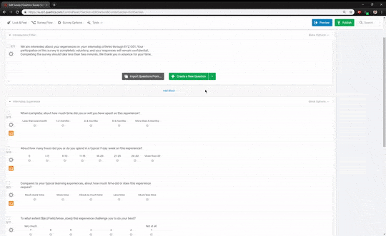
Embedded Data: Dynamic Survey Questions in Qualtrics
Surveys in higher education often target students at different levels of their degrees, which makes survey design tricky. Qualtrics has a useful feature to dynamically adapt survey questions to meet the survey requireme...Read Moreabout: Embedded Data: Dynamic Survey Questions in Qualtrics -

Changing Tableau’s Repository Location
When you download Tableau Desktop, by default Tableau adds a file folder to your documents folder called “My Tableau Repository.” This folder contains data and options for your desktop application. In additio...Read Moreabout: Changing Tableau’s Repository Location