Tips & Insights provides advice on and examples of technology used to simplify and streamline IR activities, as well as real world examples of visual displays of data (e.g., charts, graphs, maps, tables, pictures). These eAIR features are developed by members.
-
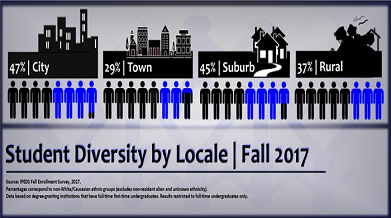
Pepperdine OIE IR Report: Student Diversity by Locale
See full report (PDF) Introduction Pepperdine is committed to the highest standards of academic excellence and Christian values, where students are strengthened for lives of purpose, service, and leadership. P...Read Moreabout: Pepperdine OIE IR Report: Student Diversity by Locale -
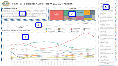
Long-term Enrollment Trends
Humboldt State University is one of 23 campuses in the nation’s largest four-year university system, the California State University system. While a formal office of Institutional Research was only founded in 2009,...Read Moreabout: Long-term Enrollment Trends -
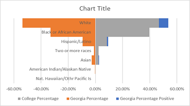
Side-by-Side Comparison Charts
Figure 1. Ethnicity Table The columns I used for the chart were Ethnicity, Georgia Percentage Positive, Georgia Percentage, and College Percentage (Figure 2). Excel 2016 is the software used to construct the chart. The ...Read Moreabout: Side-by-Side Comparison Charts -
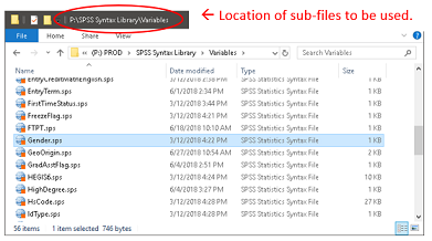
Using the INSERT Command in SPSS Syntax
There are usually some of the same variables (gender, birthdate, etc.) included in multiple data files that your office collects or maintains. Instead of duplicating the syntax in the syntax file for each data file, a sm...Read Moreabout: Using the INSERT Command in SPSS Syntax -
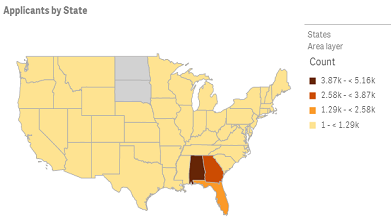
Qlik Sense: Visualizing Future Enrollment/Tuition Revenue
This visual display focuses on predicting enrollment of admitted applicants depending on the amount of a scholarship offer. Predictions are visualized using the dashboard with a possibility to explore "what if" scenarios...Read Moreabout: Qlik Sense: Visualizing Future Enrollment/Tuition Revenue