Tips & Insights provides advice on and examples of technology used to simplify and streamline IR activities, as well as real world examples of visual displays of data (e.g., charts, graphs, maps, tables, pictures). These eAIR features are developed by members.
-

Using Images as Data Points in Excel Column Charts
There are many features in Microsoft Excel that go unnoticed. One of these features allows you to add flair to your data visualization with relative ease. When creating column charts in Excel, we often utilize the defaul...Read Moreabout: Using Images as Data Points in Excel Column Charts -
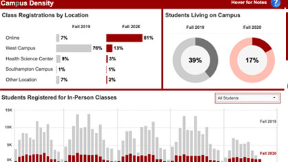
The Story Behind the Stony Brook University COVID-19 Dashboard
In summer 2020, Stony Brook University’s Senior Executive team requested the development and launch of a public-facing dashboard to display information about COVID-19 on the campus. The Office of Institutional Rese...Read Moreabout: The Story Behind the Stony Brook University COVID-19 Dashboard -

“Ctrl” Excel and Word
Did you know there are many keyboard shortcuts built into Microsoft Office that can save you time and make your life easier? It’s time to get friendly with your Control key! Here are 25 “Ctrl&n...Read Moreabout: “Ctrl” Excel and Word -
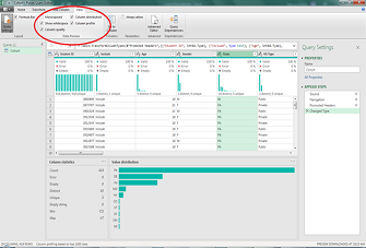
Exploring Data Using Excel’s Power Query Editor
While I primarily use Microsoft Excel’s Power Query Editor to put together a complicated table or report in a short period of time, I’ve learned that you can also use it to explore any data set. Here are the ...Read Moreabout: Exploring Data Using Excel’s Power Query Editor -
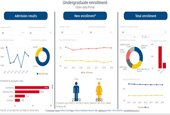
Improving Transparency With Applicant Public Access Portals
The Chilean Ministry of Education, through the Sub-secretariat for Higher Education, has instructed the universities to set up public access portals for applicants as a way to improve transparency in information and the ...Read Moreabout: Improving Transparency With Applicant Public Access Portals