Tips & Insights provides advice on and examples of technology used to simplify and streamline IR activities, as well as real world examples of visual displays of data (e.g., charts, graphs, maps, tables, pictures). These eAIR features are developed by members.
-
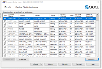
SAS Enterprise Guide: Reading, Importing, and Appending Multiple Text Files
In many circumstances, different text files are created with the same formats representing different groups or time periods. When multiple text files are held in a specific location, whether they are on a server, cloud, ...Read Moreabout: SAS Enterprise Guide: Reading, Importing, and Appending Multiple Text Files -
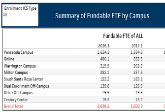
Visualizing Fundable FTE by Location
Pensacola State College is comprised of multiple campuses and centers that serve students in Northwest Florida. To visualize the total Full-Time Equivalent (FTE) of each campus and center, the Office of Institutional Res...Read Moreabout: Visualizing Fundable FTE by Location -
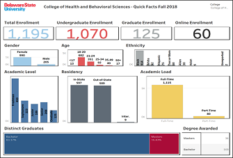
Facts at a Glance Dashboard
Each year, our Institutional Effectiveness (IE) office publishes an annual report for our Academic Affairs unit, which is one of five administrative divisions at Delaware State University. The Office of the Provost and E...Read Moreabout: Facts at a Glance Dashboard -
Creating Animations in R
If you’re looking for an excuse nowadays to spend more time inside on a computer, I recommend visiting the subreddit r/dataisbeautiful. Users submit all kinds of visualizations along with details of how they were c...Read Moreabout: Creating Animations in R -
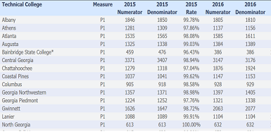
Technical Colleges and Perkins Data
A huge topic for our technical colleges has been the re-authorization of the Perkins law. This law brought substantial changes to procedures for requesting funds. One of the most significant changes was the implementatio...Read Moreabout: Technical Colleges and Perkins Data