Tips & Insights provides advice on and examples of technology used to simplify and streamline IR activities, as well as real world examples of visual displays of data (e.g., charts, graphs, maps, tables, pictures). These eAIR features are developed by members.
-
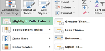
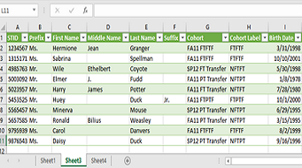
Power up Excel
Whether you're new to Excel or breathe advanced formulae, there are always shortcuts and useful features to be discovered. Have you ever wanted a distinct count in pivot tables or an easier way to format complex workbook...Read Moreabout: Power up Excel -
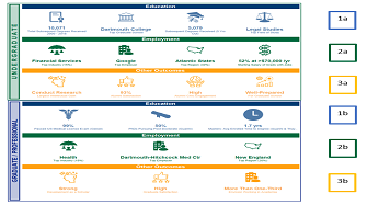
Student Outcomes: Kicking it up a Notch with Tableau
In preparation for reaccreditation, Dartmouth’s Office of Institutional Research decided to transform student outcomes data from multiple sources and formats into compelling visualizations. The publicly-available v...Read Moreabout: Student Outcomes: Kicking it up a Notch with Tableau -
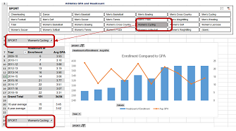
Using Slicers to Update Pivot Tables
For information where online dashboards are not available, my office frequently uses pivot tables to visualize large sets of data for our stakeholders. Often times, we use the same data set for multiple visualizations li...Read Moreabout: Using Slicers to Update Pivot Tables -
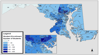
Mapping Economic Impact
Morgan State University commissioned an economic impact study in 2018. The publication of this study and the desire of the Office of Institutional Research to contribute data points to demonstrate the impact of our stake...Read Moreabout: Mapping Economic Impact -
Excel Power Query Saves Time
In Microsoft Excel, you’ve probably seen Power Pivot and Data Model, but have you discovered Power Query? Power Query is a tool introduced in 2013, which is available to all users who have Excel 2016 or later and/o...Read Moreabout: Excel Power Query Saves Time