Tips & Insights provides advice on and examples of technology used to simplify and streamline IR activities, as well as real world examples of visual displays of data (e.g., charts, graphs, maps, tables, pictures). These eAIR features are developed by members.
-
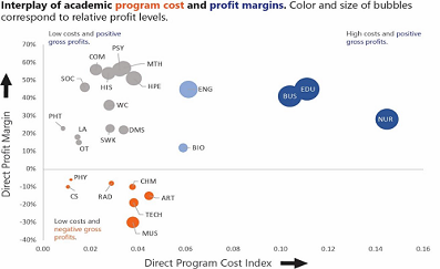
Analyzing Academic Program Fiscal Performance
Understanding the financial viability of academic programs is increasingly at the forefront of discussions at small colleges and universities. However, a simple analysis of direct gross profits can be misleading if not p...Read Moreabout: Analyzing Academic Program Fiscal Performance -

Replacing All Links in a Word Document
Preparing documents for an accreditation visit can be a stressful task. It involves many people and lots of last minute edits. Your institution may have thought ahead and prepared a website or intranet site where the ind...Read Moreabout: Replacing All Links in a Word Document -
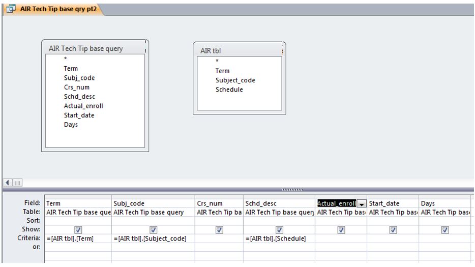
Using the Criteria Field in Microsoft Access
Many of us use Microsoft Access to extract data from Banner or other enterprise systems, or to store data that doesn’t fit in our enterprise system. This tip provides an overview of the criteria field in Access que...Read Moreabout: Using the Criteria Field in Microsoft Access -
Tip for Tableau Users
Analysts use visualizations to deliver complicated information in an easy to understand way. Dual axis function in Tableau helps users to be efficient with a message of visualization. Another name for a chart with a dual...Read Moreabout: Tip for Tableau Users -
Creating a Clear Slicer Button in Excel
Scenario: You are developing an Excel dashboard based off a Pivot table or tables and you have multiple slicers to allow different combinations of data disaggregation, as in the image below. Everyone oohs and ahs un...Read Moreabout: Creating a Clear Slicer Button in Excel