Tips & Insights provides advice on and examples of technology used to simplify and streamline IR activities, as well as real world examples of visual displays of data (e.g., charts, graphs, maps, tables, pictures). These eAIR features are developed by members.
-
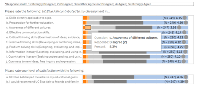
Graduating Student Survey Results Dashboard
Sharing results from our Graduating Student Survey typically meant sending or posting Excel or PDF files. Now, we're able to post interactive results in one location, allowing users to view results by year. Fro...Read Moreabout: Graduating Student Survey Results Dashboard -
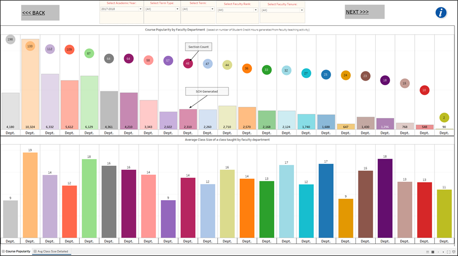
Rollins Class Size Dashboard
Class size matters to different stakeholders on campus for different reasons. Students and faculty love small class sizes for obvious reasons. Administrators like the registrar, deans, department chairs, etc., in smaller...Read Moreabout: Rollins Class Size Dashboard -
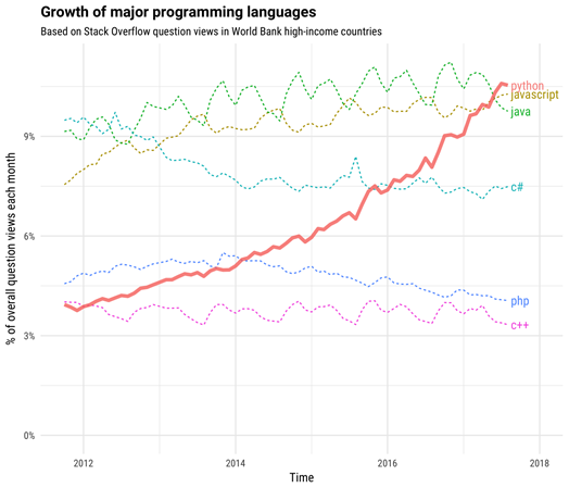
Automating Surveys with Python, Qualtrics API, & Windows Task Scheduler
Last fall, I had the opportunity to present my survey automation project using Python and Qualtrics at the Pacific Northwest Association for Institutional Research and Planning (PNAIRP). With my friend, we have since tur...Read Moreabout: Automating Surveys with Python, Qualtrics API, & Windows Task Scheduler -

Supplemental Instruction Survey Report
Supplemental Instruction (SI) is outside-of-class study sessions facilitated by student peers to enhance learning in traditionally difficult gateway courses, such as first-year math, science, logic, or statistical method...Read Moreabout: Supplemental Instruction Survey Report -
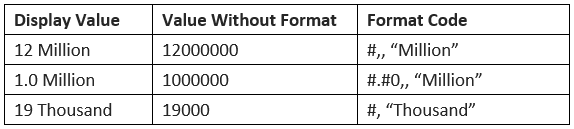
Formatting Numeric Data to “Millions” in Excel
When we report large numbers (especially related to financials), the default number formatting in Excel does not show up nicely in tables or charts, making it hard to read in a glance. One way to address this is to use c...Read Moreabout: Formatting Numeric Data to “Millions” in Excel