Tips & Insights provides advice on and examples of technology used to simplify and streamline IR activities, as well as real world examples of visual displays of data (e.g., charts, graphs, maps, tables, pictures). These eAIR features are developed by members.
-

Identifying Low-Effort Survey Responses: A Guide and App
Survey data impacts some of the most important decisions in higher education, with institutions relying on it to accurately capture the voices of their community. While many IR/IE offices are well aware of challenges in ...Read Moreabout: Identifying Low-Effort Survey Responses: A Guide and App -

Using HTML Widgets for R to Create Interactive Reports
Institutional researchers are often tasked with synthesizing large amounts of data, perhaps by visualizing it in charts or summarizing it in tabular format. Allowing users to interact with these charts or tables by sorti...Read Moreabout: Using HTML Widgets for R to Create Interactive Reports -
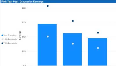
Seeing Is Believing: Using Power BI to Visualize Alumni Earnings
As higher education institutions continue to recover from challenges presented by the pandemic, they are forced to grapple with persistent nationwide enrollment declines as well as student perceptions regarding the value...Read Moreabout: Seeing Is Believing: Using Power BI to Visualize Alumni Earnings -

The Versatility of the XLOOKUP
LOOKUP, launched in 2019 by Microsoft, combines the functionality of multiple functions, including VLOOKUP and HLOOKUP, into a single source. It also offers the option to select a customized variable if no data are retur...Read Moreabout: The Versatility of the XLOOKUP -
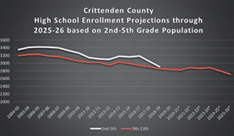
Walking Through an Enrollment Forecasting Example
A key development in higher education over the past several decades is the growth of institutional research offices that function under the core principles of explaining what is happening now and attempting to shed light...Read Moreabout: Walking Through an Enrollment Forecasting Example