Tips & Insights provides advice on and examples of technology used to simplify and streamline IR activities, as well as real world examples of visual displays of data (e.g., charts, graphs, maps, tables, pictures). These eAIR features are developed by members.
-
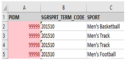
Using the Listagg Function in SQL
Our institutional research analysts frequently extract data and modify the structure of data using SQL to suit the needs of data consumers or to ease analysis. Often, we need to aggregate tables containing multiple rows ...Read Moreabout: Using the Listagg Function in SQL -
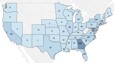
Digital Fact Book: From Data to Storytelling
Each year, most Institutional Research (IR) offices publish a Fact Book containing all the facts and figures pertaining to their institutions for distribution to board members, the leadership team, faculty, staff, and st...Read Moreabout: Digital Fact Book: From Data to Storytelling -
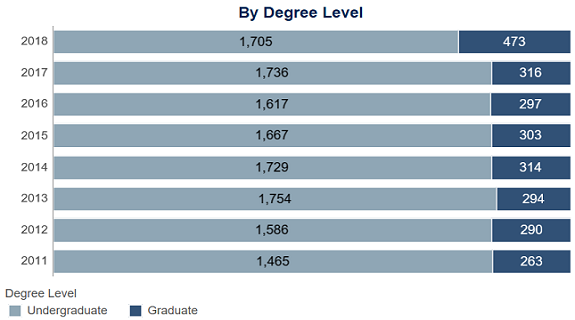
Degrees Awarded Dashboard: University of Southern Indiana
The Degrees Awarded dashboard is a section in our University Fact Book, which is powered by Tableau. The dashboard represents the number of degrees awarded each academic year and can be filtered by college, department, a...Read Moreabout: Degrees Awarded Dashboard: University of Southern Indiana -
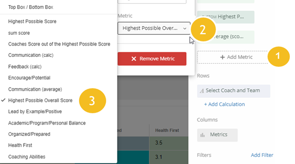
Embedding Deeper Insights into Qualtrics Dashboard
As data scientists and university employees we cannot underestimate the value of extra time. Having said that, we also understand the importance and value behind spending time discovering data and communicating its insig...Read Moreabout: Embedding Deeper Insights into Qualtrics Dashboard -
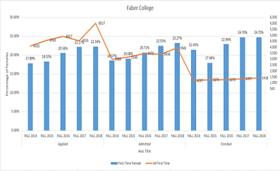
Combination Charts in Excel Made Easy
Given that a picture is worth 1,000 words, there will be occasions when you want to make your data visualization show more than just a standard chart. Microsoft Excel offers an easy way to address this by producing a com...Read Moreabout: Combination Charts in Excel Made Easy