Tips & Insights provides advice on and examples of technology used to simplify and streamline IR activities, as well as real world examples of visual displays of data (e.g., charts, graphs, maps, tables, pictures). These eAIR features are developed by members.
-
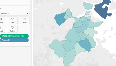
Mapping in Tableau
Visualizing geographic information helps data consumers quickly and easily derive insights and meaning. Institutional researchers, for example, may want to map students' home states or countries to help campus administra...Read Moreabout: Mapping in Tableau -

Come on and Zoom! 15 Time- and Reputation-Saving Zoom Hacks
“I have a Zoom call at 3, so make sure you only enter my office if it is an emergency AND you are fully dressed.” A little less than a year ago, at the beginning of the pandemic, when people were talking a...Read Moreabout: Come on and Zoom! 15 Time- and Reputation-Saving Zoom Hacks -
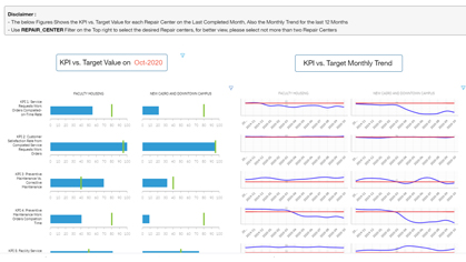
Facilities & Operations Performance Management
In 2008, American University in Cairo (AUC) moved its main operations from downtown to New Cairo. With a beautiful campus designed to accommodate 5,500 full-time students and 1,500 faculty and staff, AUC’s $400 mil...Read Moreabout: Facilities & Operations Performance Management -

Combining Data from Multiple Sources Using R
Gathering the Data A common request of our institutional research office is to combine data from multiple sources and varying formats. For example, we keep our demographic and academic information about our students in a...Read Moreabout: Combining Data from Multiple Sources Using R -
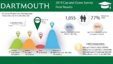
Infographics as an Alternative
While the office routinely uses Tableau dashboards to share data with the campus community, there are also projects where an infographic may be a more visually compelling alternative. The office has invested in two tools...Read Moreabout: Infographics as an Alternative