This feature provides
-
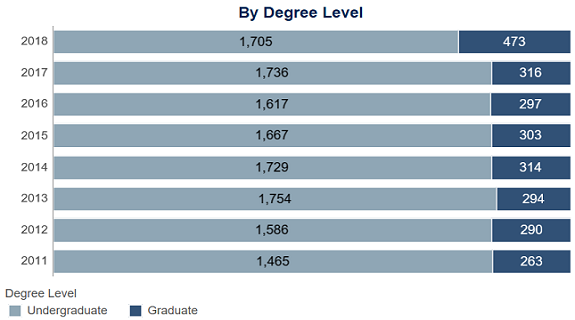
Degrees Awarded Dashboard: University of Southern Indiana
The Degrees Awarded dashboard is a section in our University Fact Book, which is powered by Tableau. The dashboard represents the number of degrees awarded each academic year and can be filtered by college, department, a...Read Moreabout: Degrees Awarded Dashboard: University of Southern Indiana -
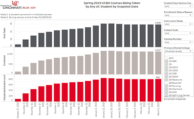
Course Enrollment Trends Dashboard
University of Cincinnati students often take classes offered at other UC campuses and vice versa. UC Blue Ash regional campus administrators and academic chairs wanted to better understand how many UCBA students we...Read Moreabout: Course Enrollment Trends Dashboard -
Visualizing Regression Results for Non-Statistics Audiences
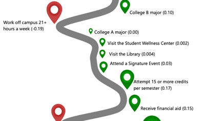
The Office of Assessment at the University of North Florida (UNF) uses infographics to succinctly visualize student engagement and success data. We’ve found them to be a useful platform to share focused messages wi...Read Moreabout: Visualizing Regression Results for Non-Statistics Audiences -
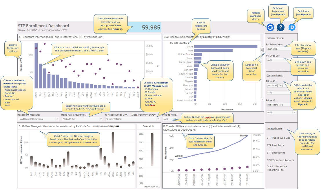
Visual Guide to STP Enrollment Dashboard in Tableau
Figure 1: STP Enrollment Dashboard Introduction Tim Miller, a blogger for DataViz at Data Science Central, recently offered suggestions for Creating a Great Information Dashboard. He nicely summarized some of the...Read Moreabout: Visual Guide to STP Enrollment Dashboard in Tableau -
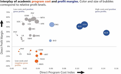
Analyzing Academic Program Fiscal Performance
Understanding the financial viability of academic programs is increasingly at the forefront of discussions at small colleges and universities. However, a simple analysis of direct gross profits can be misleading if not p...Read Moreabout: Analyzing Academic Program Fiscal Performance
- 1
- 2
- 3
- 4 (current)
- 5